Traffic and Crash Map of Pennsylvania

This is a short blog post, but it contains a downloadable! I spent a couple of weeks using as many publicly available shapefiles and other map data, provided by PennDOT and various counties, in an attempt to create the most intuitive traffic map of Pennsylvania. My objective of creating this map was to visualize several trends:

  • Trend of car accidents with respect of other elements, such as cartway width, pedestrian crossing locations, or presence of physical barriers.
  • Correlation between mixing of land use, commercial or residential, with traffic count. (Such land use classification data is only readily available for Allegheny, Philadelphia, and several neighboring counties)
  • Understanding the accessibility needed for truck routes, with the recognition of such routes needing larger lanes and paved turning paths.

Download the Traffic Map here.

This map requires QGIS to run. QGIS is a free and open source GIS mapping program. Download QGIS here.
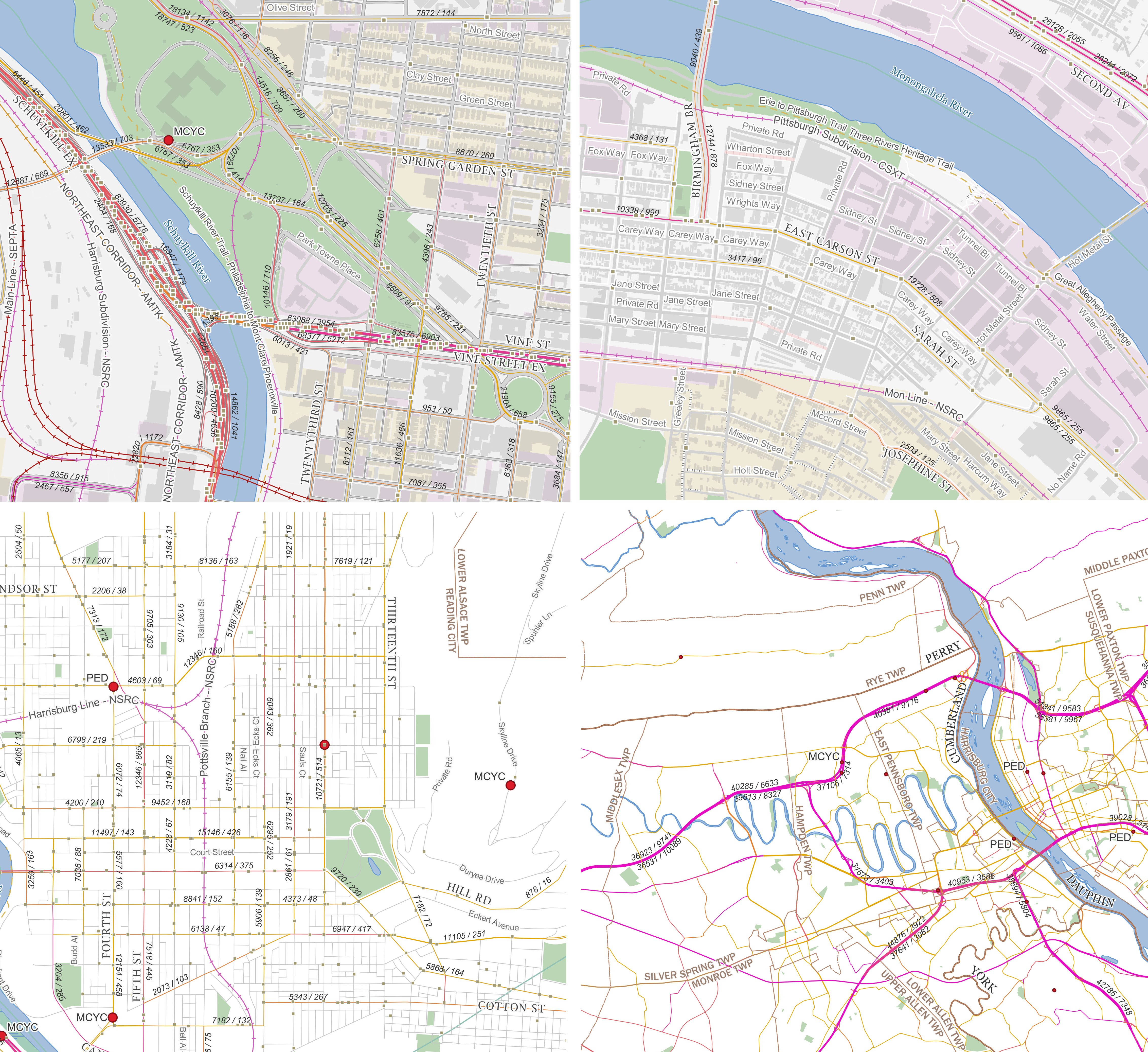
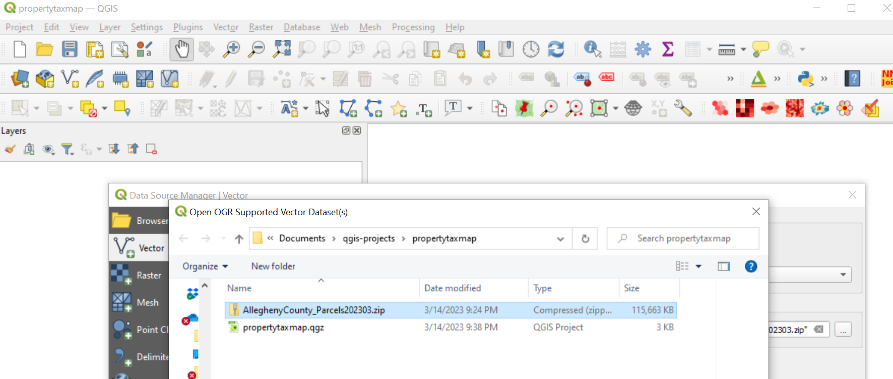
Figure 1 - Top Left: Map of the Schuykill Expressway interchange with Vine Street Expressway. A high number of non-fatal collisions occur in this short stretch of Highway. Top Right: High density development in Southside Flats in Pittsburgh. The low amount of traffic on Sarah Street suggest that the traffic on East Carson Street is mostly through traffic. Bottom Left: Car crashes in Reading, PA. Many fatal crashes, marked in red dots, in the city are either motorcycle or pedestrian collisions. Bottom Right: The purple bands of highway traffic around Harrisburg indicate that a large portion of truck traffic passes through the city.

Read More

Using QGIS to analyze property value, Part 1

GIS, or geographic information systems, is one of the most invaluable tools for data science and engineering, with its adoption being from environmental conservation, election statistics, urban planning, or even criminology. When you pair it with a scripting console, such as R-Project or Python, you can manipulate your data on a large scale before laying out the visuals on a map.

I can demonstrate an example of the benefits of using the popular open source QGIS in conjunction with R using a popular urban planning topic - property tax revenue.

Before we begin, I will recognize one of the most intimidating aspects of GIS for beginners is finding useful web resources. I will provide my sources as I go. We will establish a map by downloading shapefiles from Penn State’s geospatial data clearinghouse and download the following: Allegheny County - Parcels.

It’s recommended that you save everything into a single project folder. Import the shapefile into QGIS with Ctrl+Shift+V and open the files.

Figure 1 - Initial project folder.

Read More

Flexural buckling analysis, using R-Project

Over the past year, I’ve been astounded to find that R-project has slowly become one of my favorite programming environments. Not only do you get to use massive table data sets with many user maintained packages comparable to Python, but the advantages come all the way down to the syntax level, with everything being interpreted as columns and rows. Below is a demonstration of multiplying a list of numbers by a scalar:

1
2
3
> foo = c(1, 2, 3, 4, 5, 6); # column of numbers
> foo * 6;
[1] 6 12 18 24 30 36

Or, you can multiply two columns of equal size:

1
2
3
> bar = c(2, 3, 4, 5, 6, 7);
> foo * bar;
[1] 2 6 12 20 30 42

…all without any loops!

Read More